AUREVIA: Targeted Skincare Patches
Every Contour, Considered.
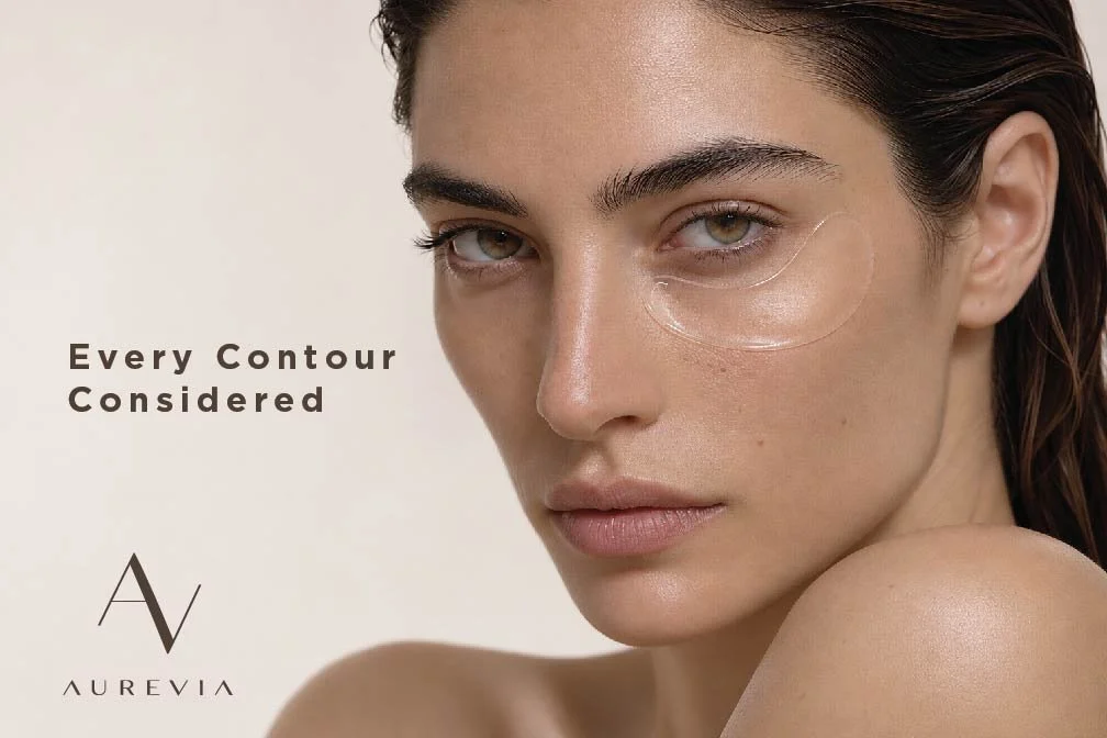
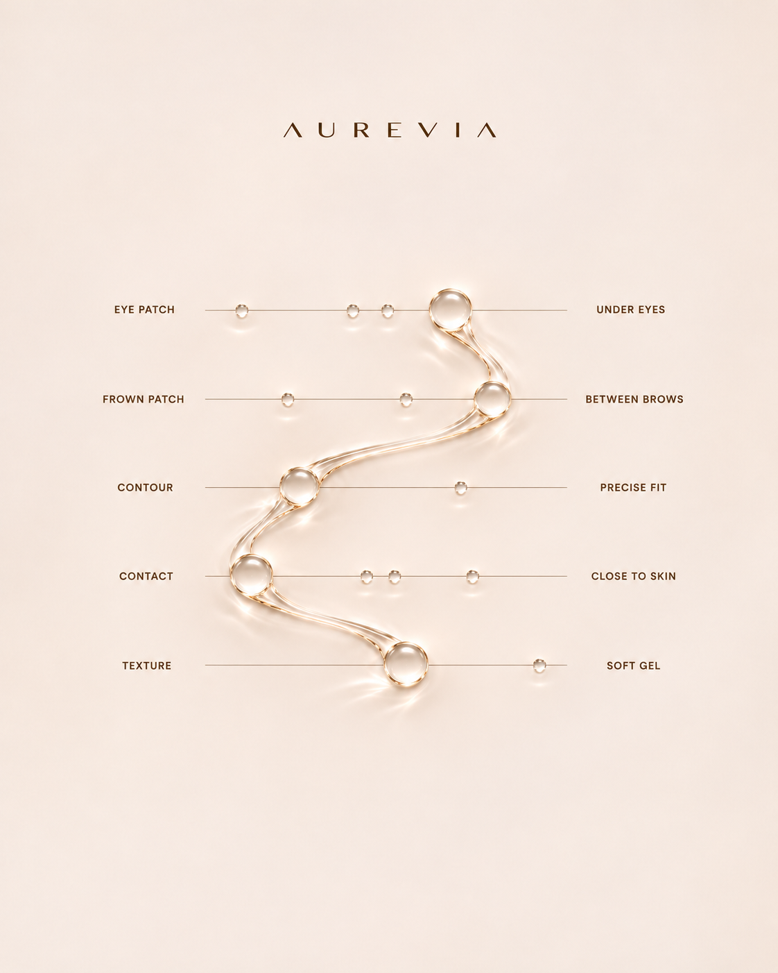
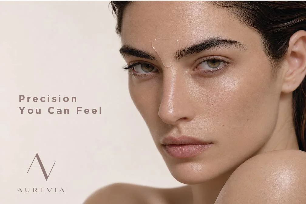
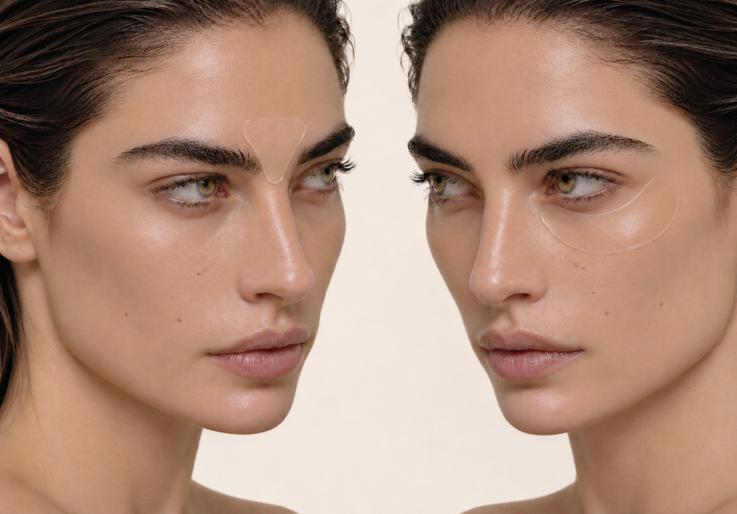
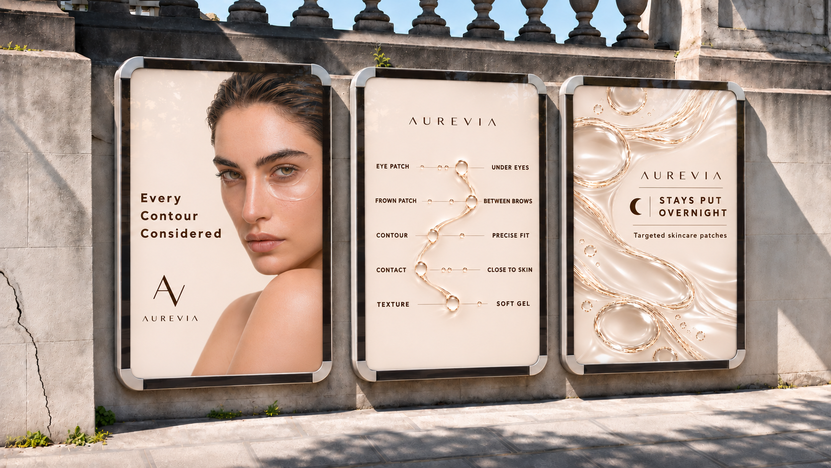
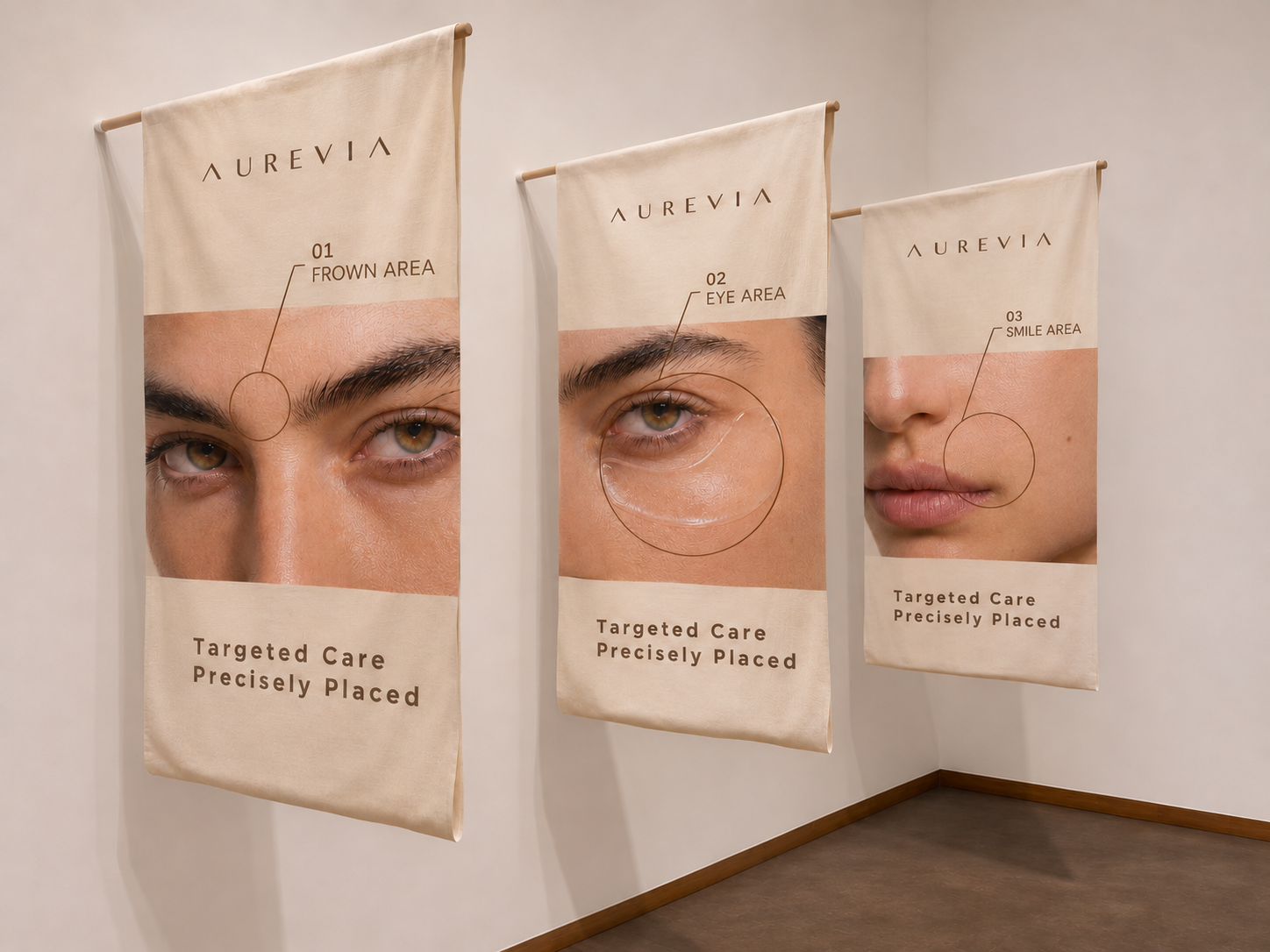
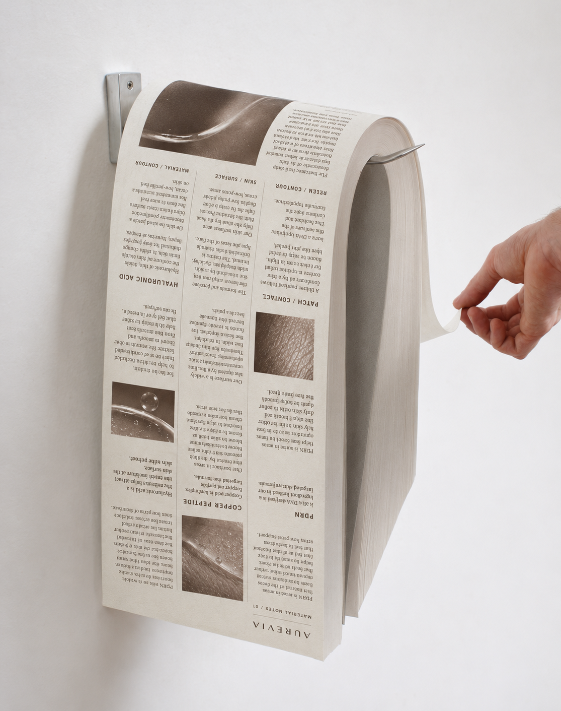
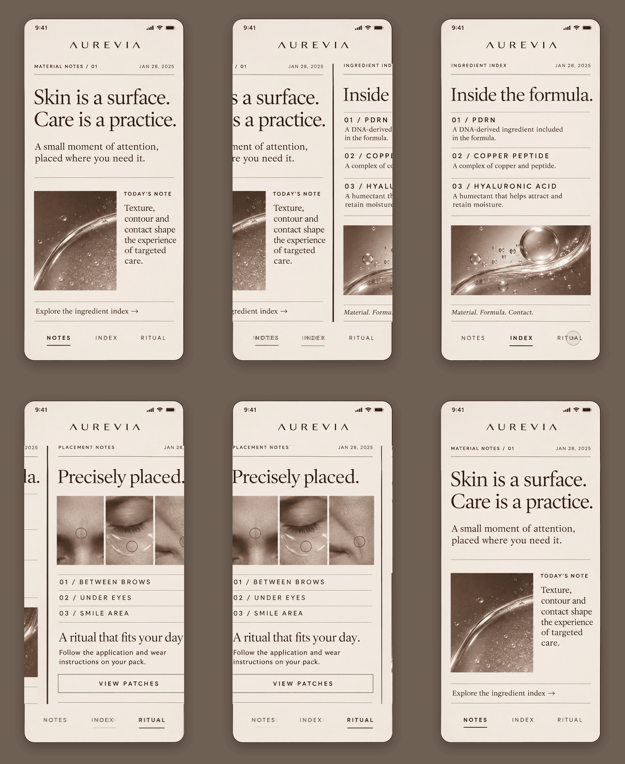
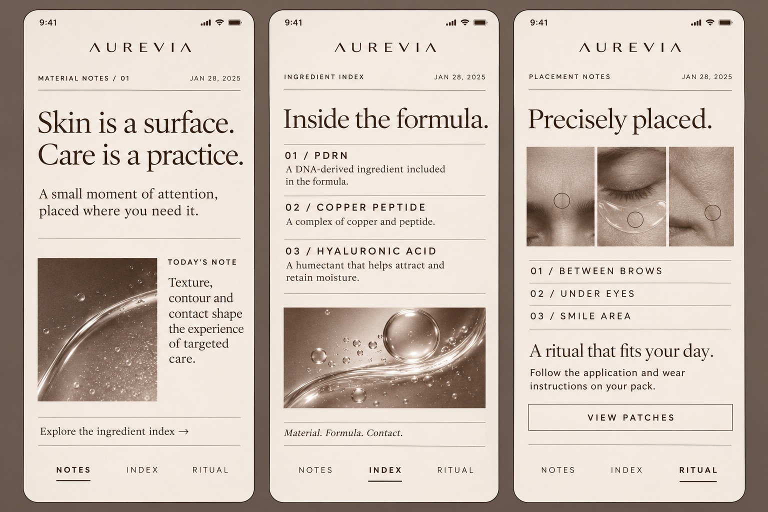
Aurevia’s identity began with the intimate relationship between patch and skin: the texture of its surface, the precision of its placement, and the way it follows each facial contour. I built the brand around these tactile qualities, making targeted care feel sensorial and naturally integrated into everyday life.
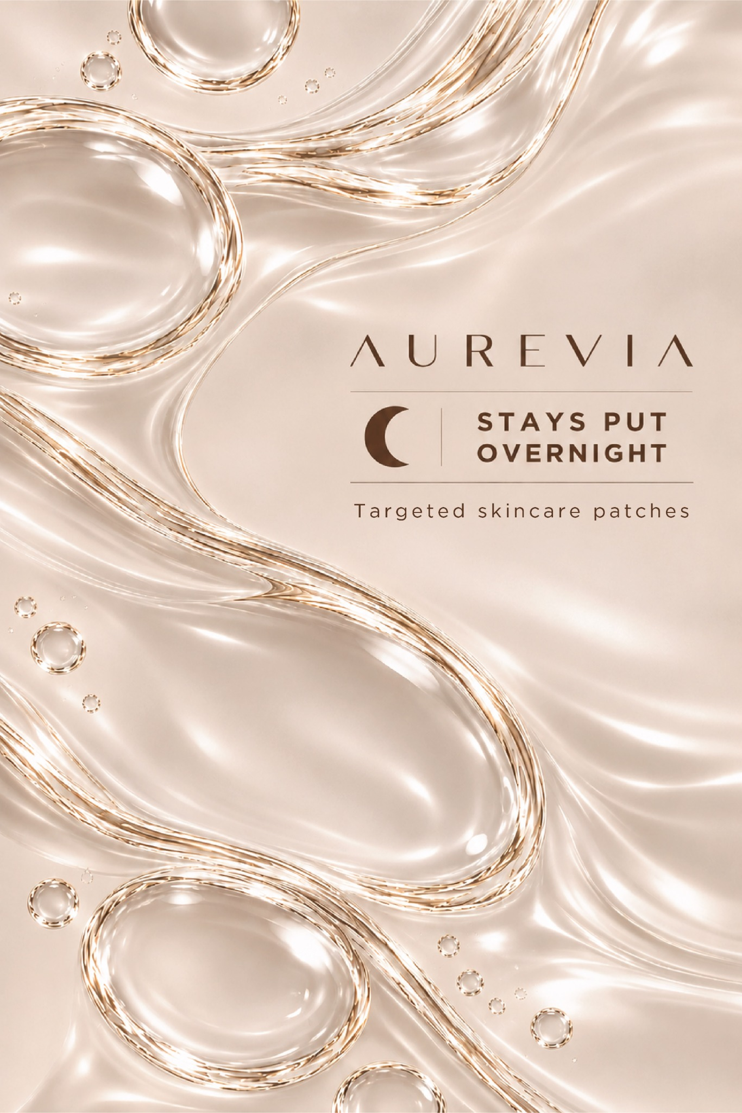
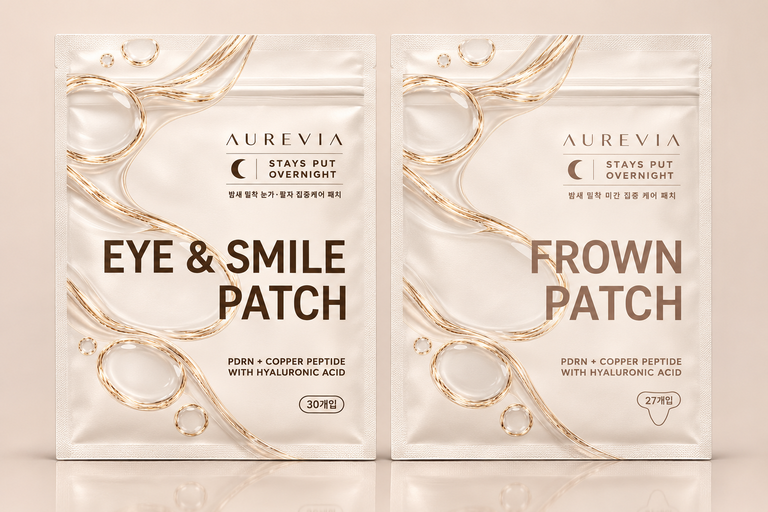
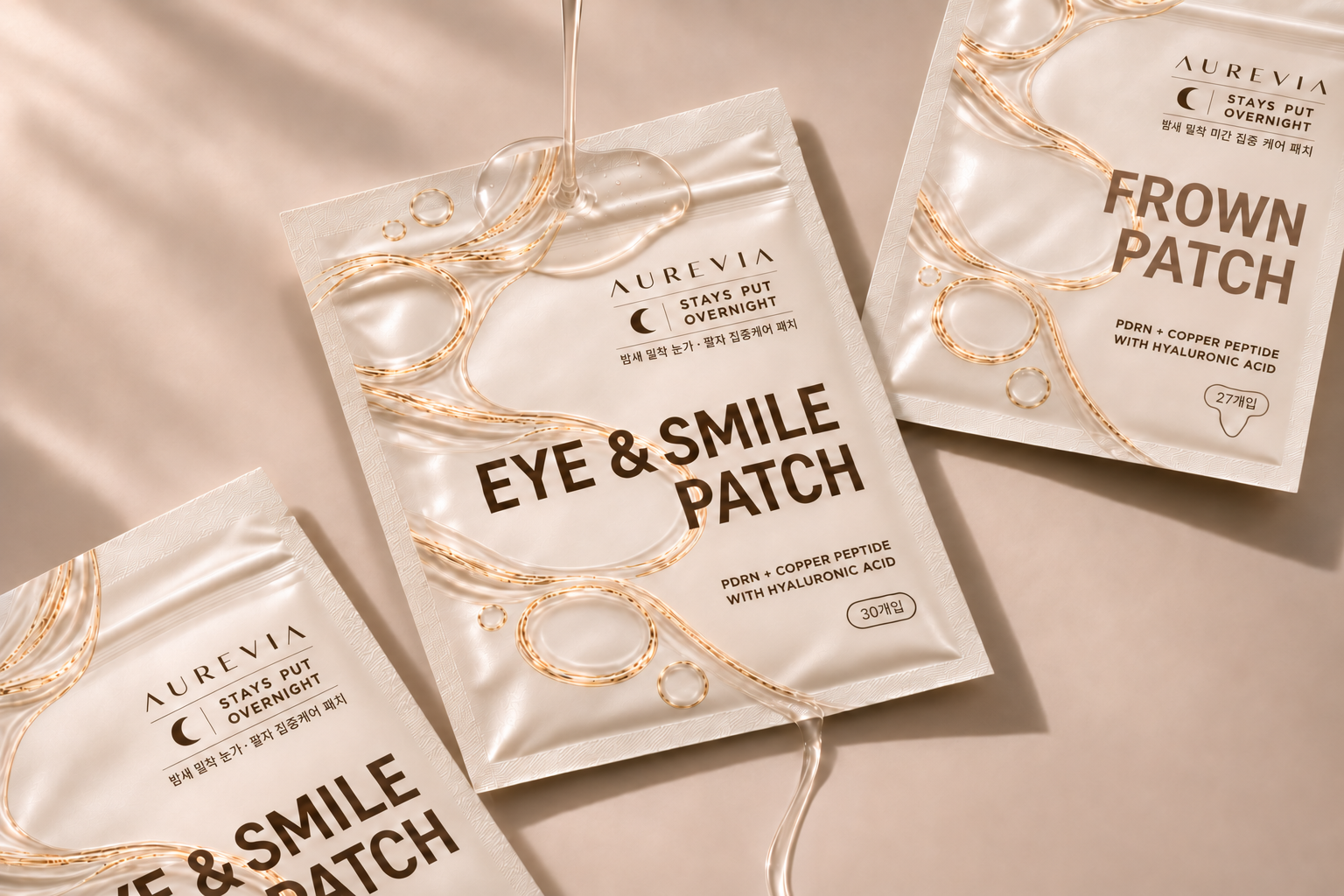
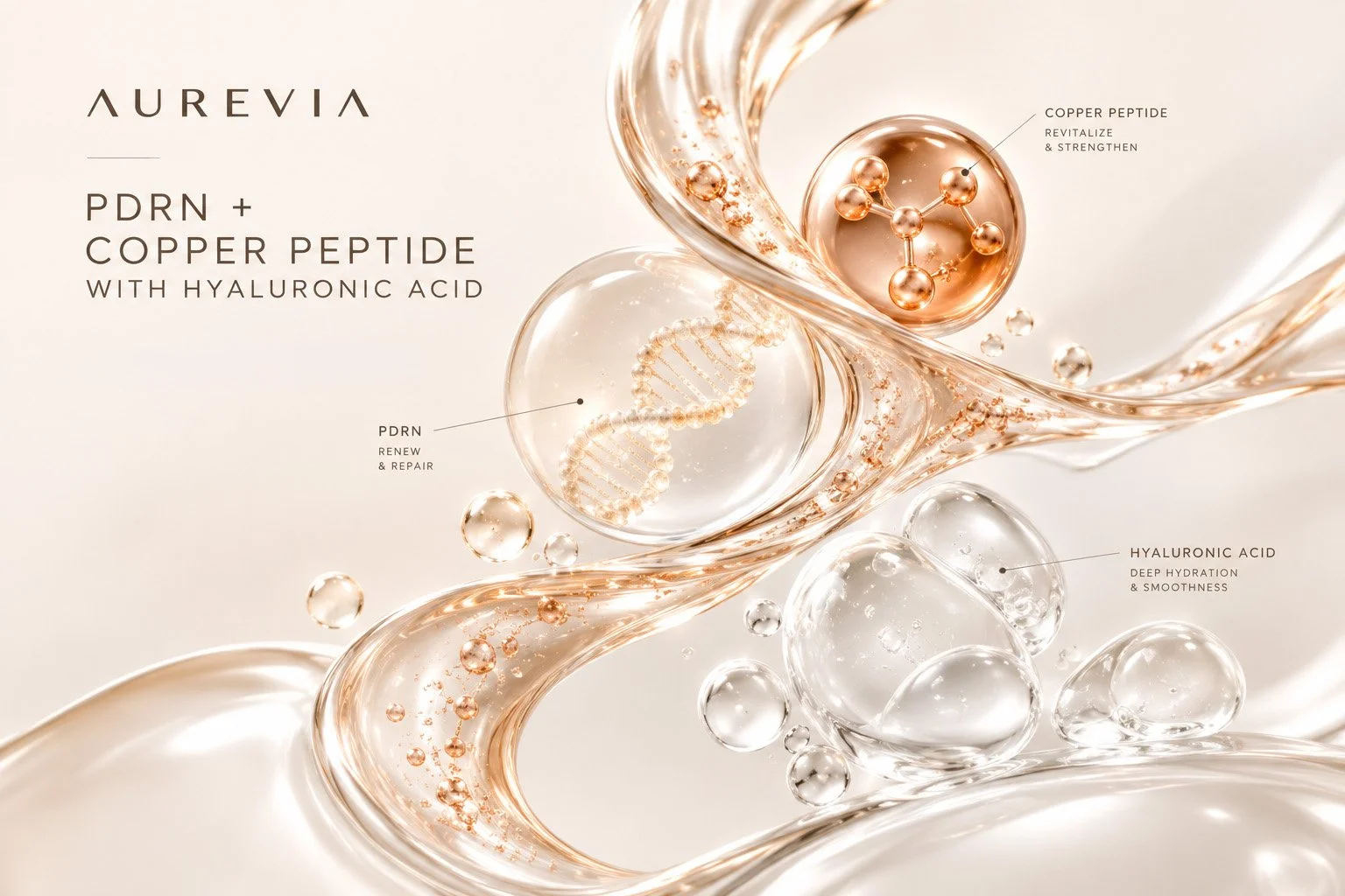
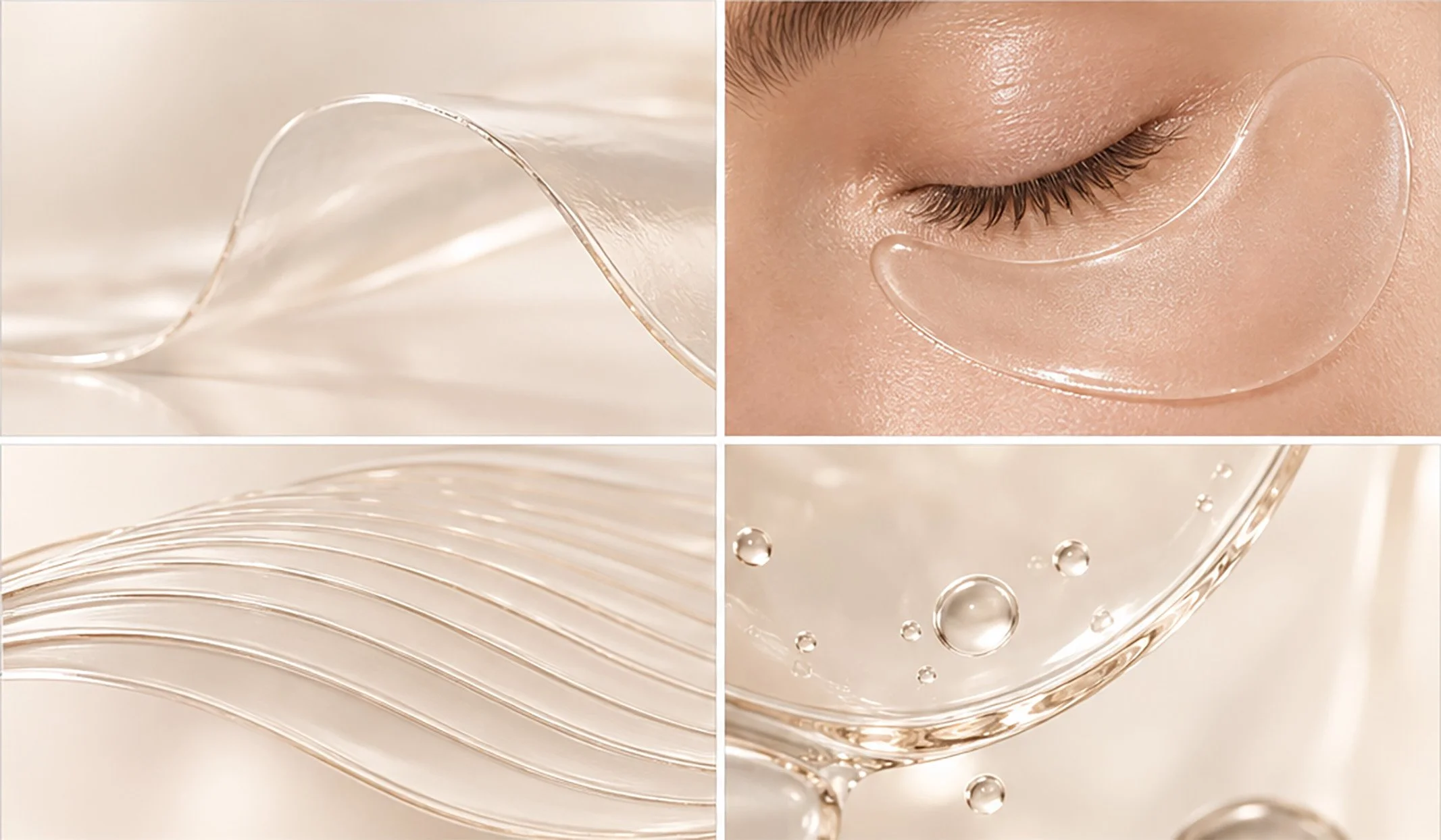
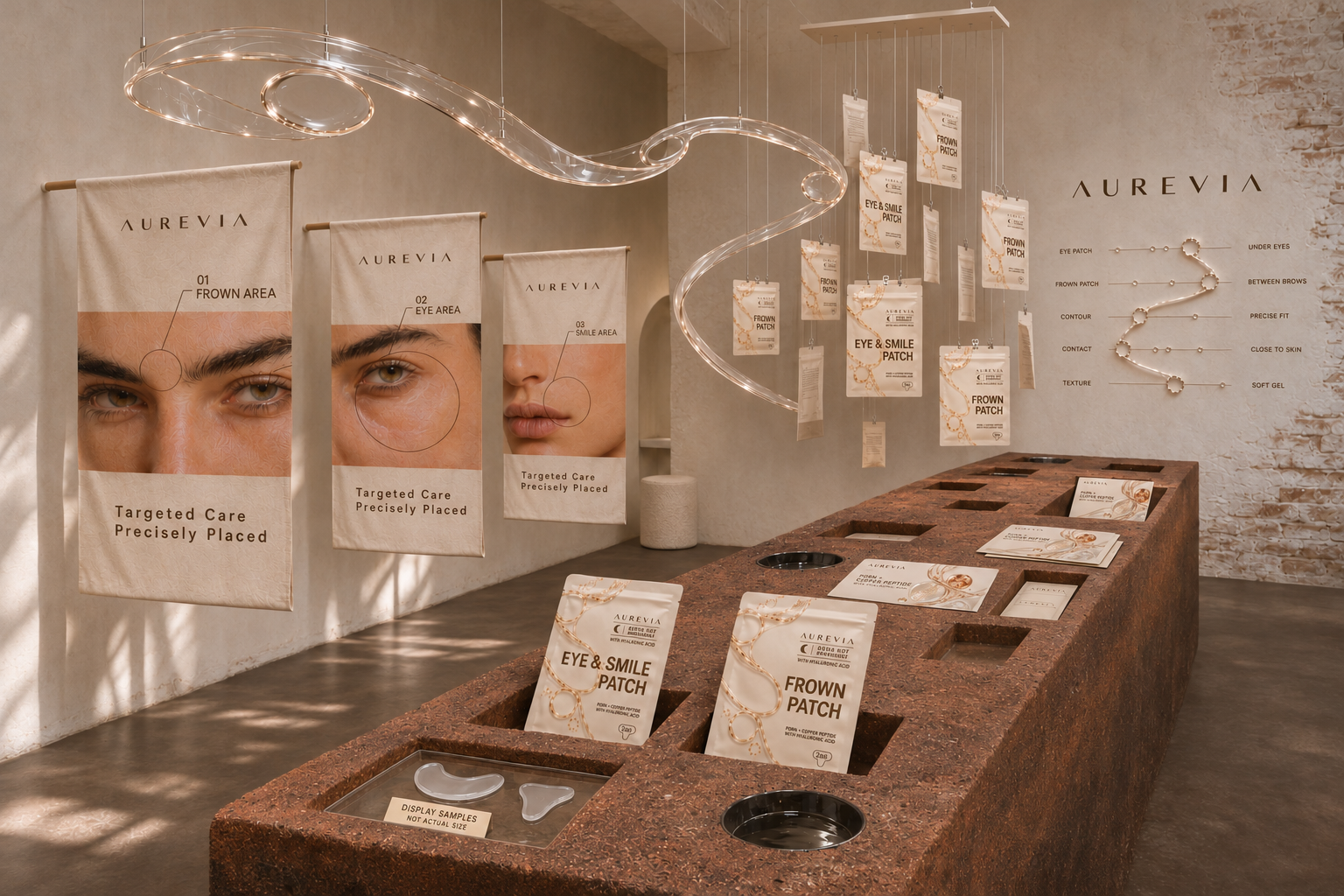
As art director I translated close contact into a visual language across identity, packaging, and imagery. Macro studies reveal the patches’ translucent material and delicate edges, while portraits of women in their thirties and beyond place them against natural skin texture and relaxed expressions. Precise compositions and clear packaging bring structure to this softness, connecting the product’s fit with the lived experience of wearing it.
Client: Aurevia
Deliverables: Brand Strategy, Brand Identity, Packaging Design, Brand Launch, Art Direction
Role: Art Director / Brand Designer